10K Advisors’ Challenge:
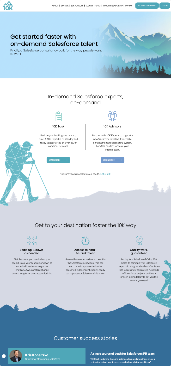
In an increasingly noisy world, how do you maintain a brand that stands out but also remains consistent with your established brand identity? 10K Advisors came to us for a brand refresh, it’d been several years since there last time and it was time to elevate their brand to the next level. Our challenge was to ensure we created a brand that broke through the noise. Many Salesforce consultancies simply incorporate clouds and the blue and white colors Salesforce is known for, ultimately making many consulting firms look the same. 10K’s brand had to be recognizable and distinct.
Our Sublime Solution:
We knew 10K was inspired by the existing Salesforce Trailhead branding that incorporates outdoor scenery and “trail” aspects that align with its namesake. Our goal was to step outside the box a bit further and create a stylized version that would align with 10K’s existing brand. The result was a combination of more sophisticated imagery of mountains and other outdoor landscapes (styled using their brand colors: green, teal, blue, with pops of yellow and pink).
10K’s brand represents the freedom of being a Salesforce consultant and creating your own future. It’s also about having a 10,000 foot view of everything (hence the name). Given that, we incorporated active lifestyle imagery of snowboarders and hikers, inlaid with geometric patterns to make it stand out. These individuals, who are pushing themselves in the outdoors, depict 10K’s belief in building your own future.
Once we created these new images and designs, we built a new website for 10K that allows users to choose their own journey. From the home page they can self-select the path that’s most relevant to them. Each journey page is custom tailored to the user and guides them through the information they need to get to know and choose 10K.
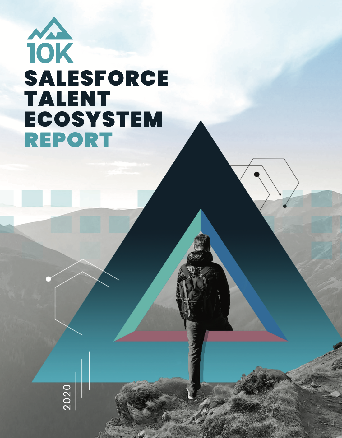
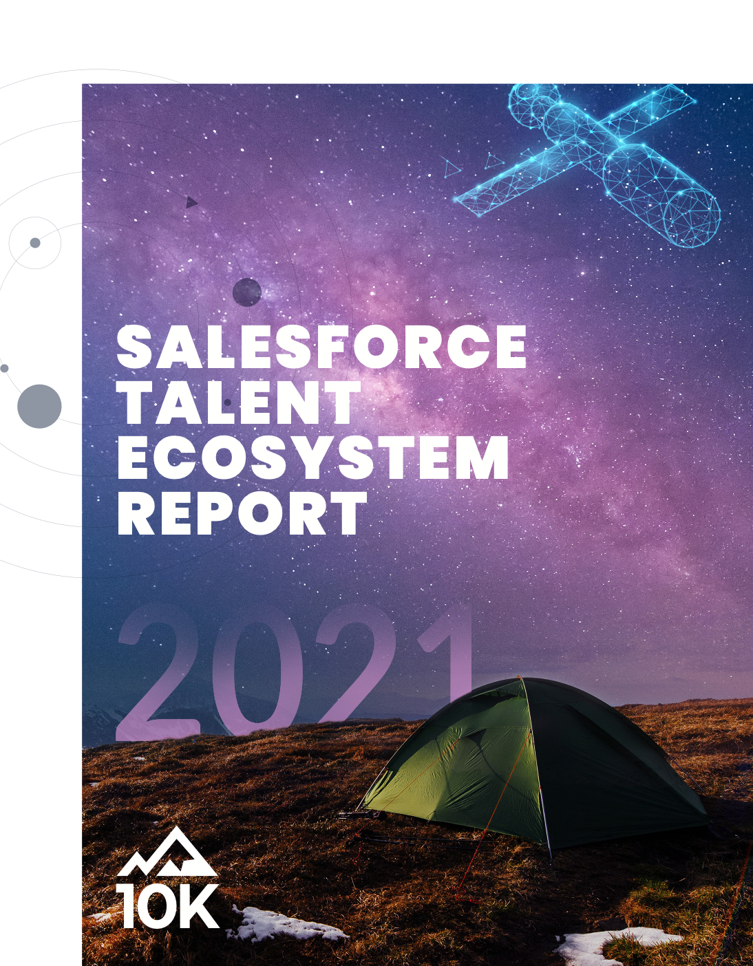
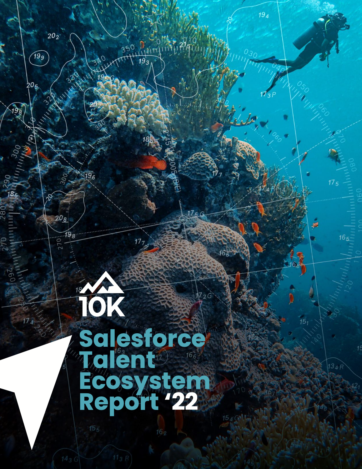
In addition to their website, we also continue to flex our creative muscles with 10K’s annual reports. Using their brand colors and fonts as a foundation, we use these reports as an opportunity to take the brand to some interesting places on the design front. For their 2021 Salesforce Talent Ecosystem Report, for instance, we leaned heavily on the context of the report itself, which covered how demand has skyrocketed for talent. We played with this metaphor by incorporating a space theme that also pulled in elements of their refreshed outdoor-focused brand.
Lastly, we continue to create social media graphics for 10K that use this new, refreshed and unique branding we had so much fun creating.